Editions Schlechter, New York City Facsimile, Æthelwold Etc. (2013)
High-resolution photographs of the entire book with cover and spine, ink samples, and erratum sheet for full-size facsimile edition. From Oak Knoll, The twenty-six letters of Æthelwold Etc. were designed to explore the relationships between alphabetical form and literary content, the limits of a letterforms individuality within the context of the alphabetical community, and the tensions between typographic assumptions, personal history, and creative desire. These various themes are further explored in the second half of the book, a section of notes in which any poetry related to a letters design is also included. The printing of the letters was conceived in the spirit of chromatic maximalism, requiring as many as nine colors to realize a single letter form and 105 different ink colors for all twenty-six... Out of print since 2010, Æthelwold Etc. is now available in meticulous facsimile, comprising the complete standard edition of the original as well as the diary of ink colors that accompanied the deluxe edition. Photographed at an insanely high resolution by 42-line in Oakland, California, every line, impression, and paper fiber of the original edition is reproduced with remarkable clarity.... Copies are available at russellmaret.com/books-in-print/aethelwold-etc-2/
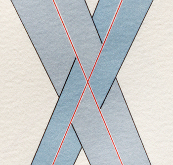
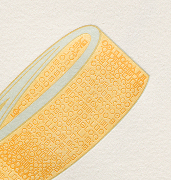
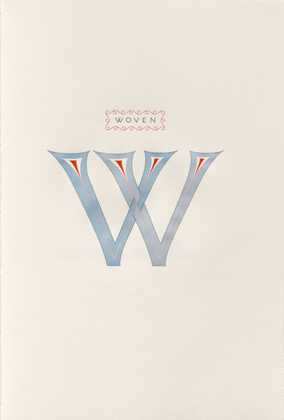
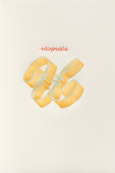
Right, Æthelwold Etc. page (14 1/2 × 9 1/2 inches), and below its detail, the letter W, derived from the titling in an eleventh-century manuscript Book of Joshua in the British Library. From the book, It is lovely to think of the W as two Vs woven in each others arms, two Vs who have chosen to moor in each other for the night. Lower right, and below its detail, the letter U, Anglaise fleuronnée from Joseph-Balthazar Silvestres, Alphabet-Album, Paris, 1843. Close-set sans serif rendition of Thomas Mores 1516 Utopia alphabet provides texture and shading for the U.