Jack Stauffacher, Printer, Greenwood Press, San Francisco, California. Books, experimental typographic prints and portfolios. (2010–2016)
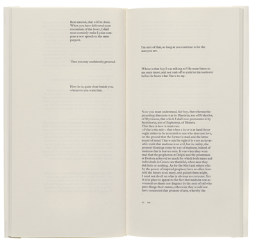
Master typographer extraordinaire Jack Stauffacher began printing with metal type when he was 16; from the very beginning his reverence for the printed word guided both his choice of texts to publish and how those texts appear on the page. Few typographers thoroughly understand the complexities underlying a typographically perfect page as does Stauffacher, exemplified by his iconic Phaedrus, which 42-line photographed and converted into a high-resolution PDF.
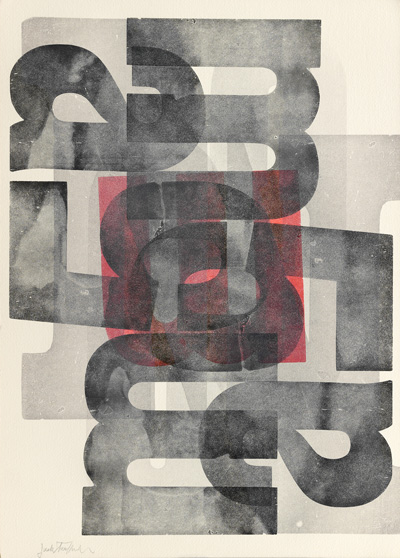
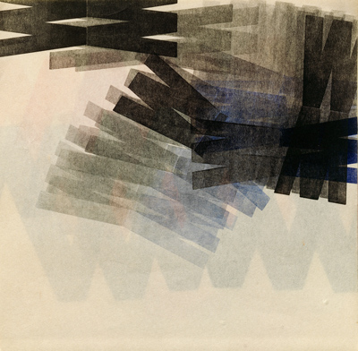
Over five years 42-line imaged Stauffachers wood type portfolios, unique experimental books, and several wooden type experimental prints, which he refers to as typographic meditations. Stauffachers work is in the permanent collections of the San Francisco Museum of Modern Art and the Los Angeles Museum of Modern Art.
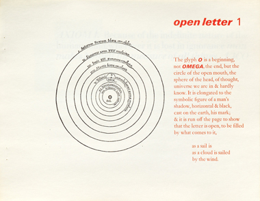
Right: Typographic experiment, ma2, 13½ × 9½ inches, 1969; Wooden letter W, Jack Stauffacher, Instructor, Positive & Negative Spaces & Figure Ground Relationship with Wooden Letters. [Berkeley: University of California, College of Environmental Design], Student Project, 8 × 8 inches, 1966. Below: page spread, Phaedrus: A Search for Typographical Form of Platos Phaedrus. San Francisco: Greenwood Press, 1978; page 1, Open Letter 1, 8½ × 11 inches, San Francisco: Greenwood Press, 1973.